


 by Totally Branded
What Logo File Do You Need for Branded Merchandise? The Complete Guide for Non-Designers
Ordering branded merchandise should be one of the easiest parts of promoting your business. You've chosen the products, you've decided where your logo is going and you're excited to see your brand brought to life. Then, just as you're ready to approve the order, your supplier comes back with a message that many businesses have seen at least once:
"Unfortunately, we can't use this artwork file."
If you've experienced this before, you're certainly not alone.
In fact, one of the biggest causes of delays within the promotional merchandise industry has nothing to do with manufacturing, shipping or stock availability. It usually comes down to artwork.
Every day, promotional merchandise suppliers receive logos that simply aren't suitable for professional printing. Sometimes they're too small. Sometimes they're screenshots taken from a website. Occasionally they're photographs of business cards or logos copied from social media profiles. Whilst these images might look perfectly acceptable on a computer screen, they often become unusable once they reach the production stage.
The result is entirely avoidable back-and-forth between suppliers and customers.
Artwork has to be checked.
Replacement files have to be requested.
Designers may need to become involved.
Deadlines become tighter.
Orders are delayed.
Understandably, this can become frustrating for everyone involved.
The important thing to understand is that this isn't the customer's fault.
Graphic design terminology isn't something most business owners deal with every day. If someone asks you for an EPS file with outlined fonts and Pantone references, there's every chance you'll have absolutely no idea what they're talking about—and that's perfectly normal.
Most people only encounter these terms when ordering printed products.
The purpose of this guide is therefore not to turn you into a graphic designer.
Instead, it's designed to explain, in straightforward language, exactly what promotional merchandise suppliers are looking for when they ask for artwork files, why those files matter and what you can do before placing an order to ensure the entire process runs as smoothly as possible.
By the end of this guide you'll understand:
- Why artwork quality matters.
- The difference between vector and raster files.
- Which logo file formats suppliers actually need.
- Why fonts sometimes create unexpected problems.
- When photographs are perfectly acceptable.
- How to tell if your file is suitable for printing.
- What to do if you've lost your original logo files.
- Why Pantone colours matter.
- How to avoid unnecessary production delays.
Most importantly, you'll feel far more confident the next time someone asks you for your logo artwork.
After all, ordering branded merchandise shouldn't feel like learning a new language.
It should simply be another straightforward part of promoting your business.
Why Suppliers Ask for Different Artwork Files
One of the biggest misconceptions surrounding promotional merchandise is that suppliers ask for specific artwork files because it makes their own jobs easier.
In reality, the opposite is usually true.
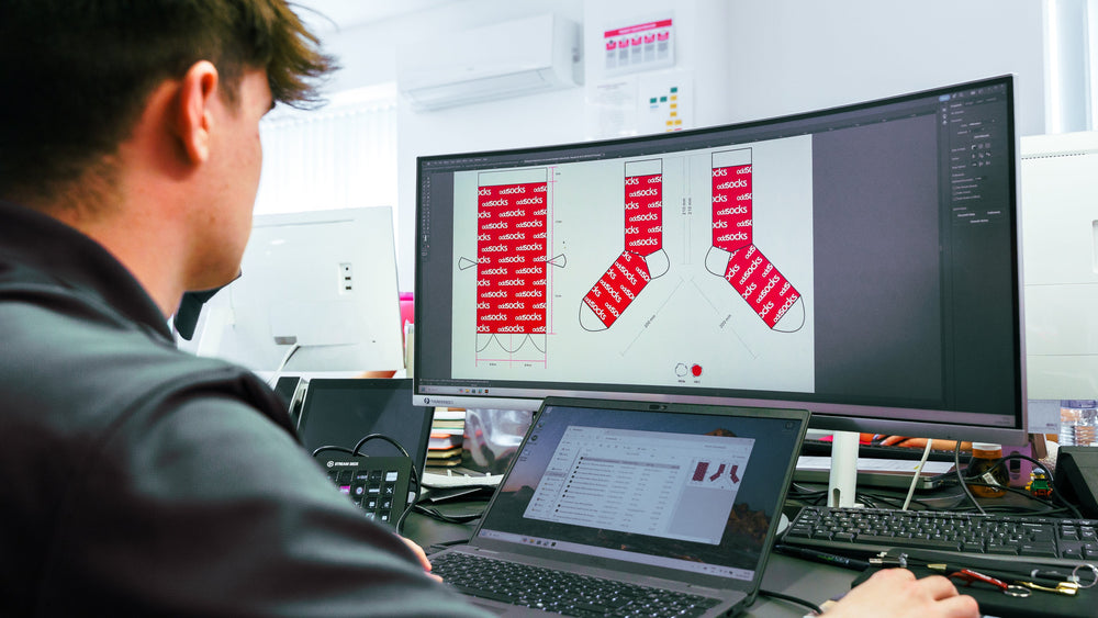
Most promotional merchandise companies employ experienced artwork teams who are perfectly capable of preparing logos, checking print files and identifying potential issues before production begins.
Many suppliers, including those with dedicated in-house graphic designers, can even recreate logos where necessary.
So why do suppliers continue asking customers for vector artwork, outlined fonts and Pantone colour references?
The answer is simple.
Because getting the correct artwork at the beginning of the process almost always produces a better finished product.
Think about the typical timeline for a branded merchandise order.
Perhaps your business is exhibiting at a trade show in three weeks' time.
Maybe you're organising employee onboarding packs.
Perhaps you're preparing Christmas gifts for clients.
Or you've got an event approaching where branded products simply have to arrive on time.
In all of these situations, time matters.
Every additional email requesting replacement artwork, every phone call chasing logo files and every conversation with a designer reduces the amount of time available for production.
Whilst suppliers will always do everything possible to keep projects moving, unnecessary artwork delays can quickly eat into production schedules.
That's why suppliers place such importance on artwork at the very beginning of an order.
When everything arrives correctly prepared, the process becomes remarkably straightforward.
Artwork can be checked.
Visual proofs can be created.
Production can begin.
Products can be delivered on schedule.
Everybody benefits.
This guide isn't about shifting responsibility onto customers.
It's about helping businesses understand the process so they can avoid delays before they happen.
In many cases, spending just five or ten minutes locating the correct logo files before requesting a quotation can save several days later in the production process.
Why Artwork Quality Actually Matters
It's easy to assume that if your logo looks good on your computer screen, it will also look good when printed onto a promotional product.
Unfortunately, that isn't always the case.
Modern computer screens are incredibly forgiving. They display images at relatively small sizes and from a comfortable viewing distance, meaning even lower-quality graphics can appear perfectly acceptable. It's only when those same graphics are enlarged and transferred onto physical products that the problems begin to appear.
Imagine downloading your company logo from your website. On the homepage it probably appears around two or three centimetres wide, and at that size it looks crisp, clean and professional.
Now imagine taking that exact same file and printing it across the back of a hoodie, onto a large exhibition banner or across the front of a sports bag.
Suddenly, every tiny imperfection becomes visible.
Instead of smooth curves, you see jagged edges.
Instead of sharp lettering, the text becomes soft and blurred.
Instead of looking like a professionally branded product, it can quickly begin to look amateurish.
This is exactly why promotional merchandise suppliers place so much emphasis on receiving the correct artwork before production begins.
It's not because they're being difficult.
It's because they want the finished product to represent your business as professionally as possible.
First Impressions Matter
Every piece of branded merchandise acts as an extension of your business.
Whether it's a pen, a water bottle, a hoodie or a mug, people subconsciously make judgements about your organisation based on the quality of the products you distribute.
If your logo appears blurred or pixelated, most recipients won't assume the artwork file was poor.
Instead, they'll often assume the product itself is poor quality.
That may sound harsh, but it's simply how people perceive branding.
Professional branding creates confidence.
Poor branding can unintentionally create the opposite impression.
This is particularly important for businesses using promotional merchandise to:
- Attend exhibitions.
- Welcome new employees.
- Thank customers.
- Launch products.
- Promote their services.
- Build brand awareness.
In all of these situations, the promotional product is representing your business long after you've handed it over.
Taking a little extra time to ensure the artwork is suitable for print is one of the easiest ways to maximise the return on your investment.

Different Products Place Different Demands on Artwork
Another reason artwork quality matters are because promotional products vary enormously in size.
The same logo may need to appear on:
- A small keyring.
- A ballpoint pen.
- A coffee mug.
- A notebook.
- A polo shirt.
- A hoodie.
- A gazebo.
- An exhibition backdrop.
Each of these products presents different challenges.
For example, tiny text that works perfectly on a website may become completely unreadable when printed onto a pen.
Conversely, a logo designed for social media may appear perfectly sharp online but become noticeably pixelated when enlarged across a two-metre exhibition banner.
This is why suppliers don't simply check whether your logo exists.
They check whether it's suitable for the specific product you've ordered.
The artwork required for a business card may not necessarily be suitable for a printed flag.
Likewise, a logo that works perfectly on a mug may require slight adjustments before being embroidered onto clothing.
Professional artwork checking helps identify these issues before production begins, ensuring your branding always performs as intended regardless of the product.
Why Suppliers Stop Orders Before Production
One question customers sometimes ask is:
"If my logo isn't ideal, why can't you just print it anyway?"
The simple answer is because a reputable supplier wants you to be happy with the finished product.
Imagine receiving several hundred branded hoodies only to discover that your company logo is blurry across every single one.
At that stage, it's too late.
The products have already been decorated.
The cost has already been incurred.
Nobody benefits.
For that reason, experienced promotional merchandise suppliers carry out artwork checks before production starts.
If they notice potential issues, they'll usually contact you and explain exactly what's wrong.
Common examples include:
- Low-resolution images.
- Missing fonts.
- Incorrect file formats.
- Poor-quality screenshots.
- Logos copied from websites.
- Artwork that's simply too small for the intended print size.
Although this may feel like an inconvenience at the time, it's actually one of the most valuable parts of the ordering process.
It's far better to spend an extra day sourcing the correct artwork than to receive products that don't accurately represent your business.
Prevention Is Better Than Correction
The easiest way to avoid artwork-related delays is to prepare your branding before you begin requesting quotations.
If possible, locate:
- Your original logo files.
- Brand guidelines.
- Pantone colour references.
- Any previous print-ready artwork.
Having these files readily available means suppliers can begin checking and preparing artwork almost immediately.
It also gives you confidence that the finished products will accurately reflect your existing brand identity.
For businesses that order promotional merchandise regularly, creating a simple folder containing all these files can save considerable time in the future.
Rather than searching old email conversations every time you place an order, everything you need will already be organised and ready to send.
Understanding Vector and Raster Files
If you've ever ordered branded merchandise before, there's a good chance you've been asked for a vector file.
For many people, that's the point where the conversation suddenly becomes confusing.
Terms like:
- Vector.
- Raster.
- EPS.
- SVG.
- AI.
- DPI.
can sound highly technical if you've never encountered them before.
The good news is that the underlying concept is actually remarkably straightforward.
Once you understand the difference between the two main types of image file, almost everything else begins to make sense.
In simple terms, there are only two types of digital image that you need to know about:
- Raster images.
- Vector images.
Everything else is simply a variation of one of those two categories.
Understanding which one you have—and which one your supplier needs—is one of the most useful things you can learn before ordering branded merchandise.
Raster Images Explained in Plain English
Let's start with the type of file that most people already have without even realising it.
A raster image is simply an image that's made up of thousands—or sometimes millions—of tiny, coloured squares known as pixels. Every photograph you've ever taken on your phone is a raster image. Likewise, most of the images you download from websites or social media are raster files too.
Common raster file formats include:
- JPEG (.jpg)
- PNG (.png)
- GIF (.gif)
- TIFF (.tif)
- BMP (.bmp)
These are excellent file types for many everyday uses. They work perfectly on websites, social media platforms, PowerPoint presentations and email signatures because they're being displayed at relatively small sizes.
The problems only begin when you ask them to do something they weren't designed to do.
Why Raster Images Lose Quality
Imagine creating a mosaic using thousands of tiny, coloured tiles.
When viewed from a distance, the image looks smooth and detailed because the individual tiles blend together.
Now imagine taking that same mosaic and stretching it to twice its original size.
You don't magically create more tiles.
Instead, each tile simply becomes larger.
Eventually, those individual squares become visible, and the image starts to look blocky.
That's essentially what happens with a raster image.
The software isn't creating new detail.
It's simply making the existing pixels larger.
This is why low-resolution logos often become blurred or pixelated when enlarged.
A Common Example
Let's imagine your company logo appears on your website.
Perhaps it's only 250 pixels wide because that's all the website needs.
On the screen, it looks absolutely fine.
Now imagine you decide to print that same logo across the back of a hoodie.
Instead of displaying the image at 250 pixels wide, the printer now needs artwork that might effectively represent several thousand pixels across.
Unfortunately, the original image simply doesn't contain enough information.
The printer has no choice but to enlarge each individual pixel.
The result?
Jagged edges.
Soft text.
Blurry graphics.
A logo that no longer looks particularly professional.
This is why promotional merchandise suppliers are often unable to use logos downloaded directly from websites.
It's not because the logo itself is wrong.
It's because the file simply wasn't designed for large-format printing.
Why PNG Files Can Be Misleading
One of the biggest misconceptions surrounding artwork is the belief that a PNG file automatically means the artwork is suitable for professional printing.
This isn't necessarily true.
PNG is simply a file format.
It doesn't tell you anything about the quality of the artwork inside.
For example:
- A PNG could be 5,000 pixels wide and perfectly suitable for certain print applications.
- Another PNG could be only 150 pixels wide and completely unsuitable for anything other than a website.
Both files are technically PNGs.
Only one is likely to produce a professional printed result.
This is why suppliers don't simply ask what type of file you have.
They also need to assess the quality and resolution of that file.
Screenshots Are Rarely Suitable
Another situation suppliers encounter surprisingly frequently is customers sending screenshots.
Perhaps the logo has been copied from:
- A website.
- LinkedIn.
- Facebook.
- Instagram.
- A PDF viewed on-screen.
Whilst screenshots may look perfectly acceptable on a phone or laptop, they're rarely suitable for professional print.
Why?
Because a screenshot is simply another raster image.
In fact, it often contains even fewer pixels than the original logo.
Every time artwork is copied, downloaded or screenshotted, there's a risk that image quality is reduced.
For this reason, screenshots should generally be viewed as reference images rather than production-ready artwork.
Why Vector Files Are the Gold Standard
Now let's compare that with a vector file.
Whilst raster images are made from pixels, vector artwork is created using mathematical paths, curves and shapes.
That may sound technical, but the concept is actually remarkably simple.
Imagine drawing a perfect circle.
Rather than storing millions of coloured squares to represent that circle, a vector file simply stores the mathematical instructions needed to recreate it.
For example:
- Draw a circle.
- Make it this size.
- Fill it with this colour.
- Position it here.
Because those instructions are mathematical rather than pixel-based, they can be scaled to virtually any size without losing quality.
Whether that circle is:
- 10 millimetres wide.
- 10 centimetres wide.
- 10 metres wide.
It remains perfectly smooth.
The computer simply redraws it using the same mathematical instructions.
An Easy Way to Think About It
Perhaps the easiest way to understand the difference is to imagine two maps.
One is a printed road map.
If you photocopy it several times and enlarge it, eventually the text becomes fuzzy and difficult to read.
The other is a GPS navigation system.
It doesn't matter how much you zoom in or out.
The roads remain perfectly sharp because the software redraws everything continuously.
Raster artwork behaves like the printed map.
Vector artwork behaves like the GPS.
Why This Matters for Promotional Merchandise
Promotional products come in almost every imaginable size.
Your logo may need to appear on:
- A pen.
- A keyring.
- A notebook.
- A mug.
- A water bottle.
- A hoodie.
- A gazebo.
- A banner.
- Exhibition graphics.
The beauty of vector artwork is that the same file can be used across every one of these products.
Your supplier doesn't need multiple versions.
They don't need to recreate the artwork.
They simply scale the vector file to the appropriate size.
Whether the logo ends up being:
- 5mm wide on a pen.
or
- 5 metres wide on exhibition graphics.
the artwork remains perfectly crisp.
This is why vector files are considered the industry standard for professional printing.
The Aeroplane Analogy
One of the best ways to explain the power of vector artwork is with a simple example.
Imagine your company logo needed to be printed on the side of a commercial aeroplane.
Not a model aeroplane.
A real one.
If your logo existed only as a small JPEG downloaded from your website, there would be nowhere near enough image information to print it at that size.
It would look terrible.
However, if your logo exists as a proper vector file, it could be enlarged to cover the entire aircraft whilst remaining perfectly sharp.
The software simply redraws the mathematical paths at the new size.
That's why professional designers almost always create logos as vector artwork in the first place.
It provides complete flexibility regardless of where the branding eventually appears.
Which Vector File Formats Should You Keep?
Fortunately, you don't need to remember dozens of different file types.
For promotional merchandise, there are really only four that matter most:
- AI (Adobe Illustrator)
- EPS
- SVG
- A properly exported vector PDF
These are the file formats that most promotional merchandise suppliers will be delighted to receive.
If you have one—or preferably several—of these saved alongside your brand assets, you'll already be in an excellent position the next time you order branded merchandise.
Understanding PDFs – Why They Can Be Confusing
If there's one file format that causes more confusion than any other when ordering branded merchandise, it's the PDF.
Most people assume that if they have a PDF version of their logo, they're ready to go. After all, PDFs are widely used for professional documents, brochures and presentations, so it seems logical that they would also be the perfect format for printing.
Sometimes they are.
Sometimes they aren't.
The important thing to understand is that a PDF isn't actually an image format at all. Instead, it's more like a container that can hold different types of content.
Think of it like a suitcase.
Looking at the outside of the suitcase doesn't tell you what's inside it.
It could contain clothes.
It could contain books.
It could contain electronics.
Until you open it, you simply don't know.
PDF files work in exactly the same way.
One PDF might contain perfectly prepared vector artwork that is ideal for promotional merchandise printing.
Another PDF might simply contain a low-resolution JPEG that someone has inserted into a document before saving it.
From the outside, both files look identical.
From a production perspective, they couldn't be more different.
Why One PDF Works and Another Doesn't
Professional designers often create artwork using software such as Adobe Illustrator or Adobe InDesign before exporting the finished design as a PDF.
When exported correctly, that PDF retains all the original vector information.
This is exactly what promotional merchandise suppliers want.
However, many PDFs are created in completely different ways.
For example, someone might:
- Copy a logo from a website into Microsoft Word.
- Create a simple document.
- Save it as a PDF.
Whilst the finished PDF may look perfectly acceptable on screen, the logo inside it is still only a low-resolution raster image.
Saving the document as a PDF hasn't magically improved the artwork.
It has simply wrapped the original image inside a different file format.
This is why suppliers sometimes receive PDFs that unfortunately still aren't suitable for production.
The file extension alone doesn't guarantee print quality.
Don't Worry if You're Unsure
The good news is that you don't need specialist software to determine whether your PDF contains vector artwork.
If you're unsure, simply send the file to your supplier.
Most experienced artwork teams can determine within a matter of seconds whether a PDF contains:
- Vector artwork.
- Raster artwork.
- Outlined fonts.
- Embedded images.
- Production-ready graphics.
They'll quickly tell you whether the file is suitable or whether an alternative version would be preferable.
There's absolutely no expectation for customers to understand the technical structure of a PDF.
That's part of your supplier's job.
Why Outlined Fonts Matter
Once you've located a vector version of your logo, there's one additional consideration that's often overlooked.
Fonts.
This is one of those technical details that rarely causes problems until the day it suddenly does.
Fortunately, it's also one of the easiest issues to prevent.
What Does "Outlining Fonts" Actually Mean?
When a designer creates a logo, the software usually recognises the lettering as editable text.
For example, your company name might be written using a font such as:
- Helvetica.
- Gotham.
- Futura.
- Avenir.
- Montserrat.
Whilst you're designing the logo, that's perfectly normal.
However, when the artwork is shared with someone else, the receiving computer also needs access to that same font.
If it doesn't, the software has a problem.
It can't display a font that doesn't exist.
Instead, it substitutes the missing font with something else.
Sometimes the replacement is reasonably similar.
Sometimes it's dramatically different.
Either way, your carefully designed logo no longer looks exactly as it should.
Why This Happens
Imagine writing an important document using a very specific handwriting style.
You then send that document to somebody whose computer has never heard of that handwriting style before.
The software has no choice but to guess.
That's effectively what happens when fonts haven't been outlined.
The software replaces your chosen typeface with the closest alternative it can find.
For ordinary documents this might not matter very much.
For company branding, however, even small changes can alter the appearance of a logo.
What Happens When Fonts Are Outlined?
Outlining solves this problem completely.
Rather than treating your company name as editable text, the designer converts every letter into an individual vector shape.
From that point onwards, there are no fonts involved.
The software no longer sees the word "Totally Branded."
Instead, it simply sees a collection of carefully drawn shapes.
Those shapes will look exactly the same regardless of which computer opens the file.
No substitutions.
No missing fonts.
No unexpected changes.
Your logo appears exactly as the designer intended.
Should You Outline Every Font?
For promotional merchandise artwork, the answer is generally yes.
Any text that forms part of the final design should ideally be outlined before the artwork is supplied for production.
This includes:
- Company names.
- Straplines.
- Slogans.
- Product names.
- Any decorative typography.
Most professional designers routinely do this before exporting artwork.
In fact, it usually takes them only a matter of seconds.
If you're requesting logo files from a designer, one simple sentence is often all that's needed:
"Could you please outline all fonts before exporting the artwork?"
Any experienced designer will immediately understand what you mean.
The Exception – When Raster Images Are Exactly What You Need
Up to this point, we've spoken almost exclusively about vector artwork.
That might leave you wondering whether raster images should ever be used.
The answer is yes.
In fact, there are many situations where a raster image isn't just acceptable—it's actually the correct file type.
The biggest example is photography.
Photographs Can't Be Turned into True Vectors
If you're printing:
- A landscape photograph.
- A team photograph.
- A product image.
- A lifestyle image.
- A full-colour background.
then a vector file simply isn't possible.
Photographs contain millions of tiny colour variations that can't realistically be recreated using mathematical vector paths.
That's completely normal.
No supplier expects photographic images to be supplied as vectors.
Instead, the focus shifts from vector artwork to image quality.
High-Resolution Photography for Promotional Products
When using photographs on promotional merchandise, the most important consideration becomes resolution.
Rather than asking for vector artwork, suppliers will usually ask for the highest-resolution image available.
The more detail contained within the image, the better the finished print is likely to be.
As a general guide, professionally printed promotional products typically work towards a resolution of approximately 300 DPI (dots per inch).
Without becoming overly technical, DPI simply refers to how much detail exists within an image.
Higher DPI generally means:
- Sharper images.
- Greater detail.
- Better print quality.
- More professional results.
By contrast, images downloaded from websites are often only around 72 DPI, which is perfectly suitable for digital viewing but may not provide sufficient quality for larger printed products.
This is another reason suppliers often discourage customers from downloading images directly from websites for print purposes.
The image may look excellent online whilst lacking the resolution required for physical printing.
A Simple Rule of Thumb
If you're working with photographic artwork rather than logos, ask yourself:
"Is this the original photograph?"
If the answer is yes, you're probably already in a much stronger position than if you're using an image copied from a website or social media platform.
Whenever possible, always supply the original image file rather than a compressed or downloaded version.
Doing so gives your supplier the greatest opportunity to produce the highest possible print quality.
How to Tell if Your Logo Is Actually a Vector File
By this point, you might be thinking:
"This all makes sense, but how do I actually know whether the file I have is a vector?"
It's one of the most common questions promotional merchandise suppliers are asked, and it's a perfectly reasonable one.
The reality is that most people don't spend their days working with graphic design software, so there's no reason to expect them to recognise a vector file just by looking at it.
In fact, one of the biggest misconceptions is that if a logo looks sharp on your computer screen, it must be suitable for printing.
Unfortunately, that's not always the case.
A file can appear perfectly crisp on screen but still be completely unsuitable for producing high-quality branded merchandise.
Fortunately, there are several simple ways to identify whether your artwork is likely to be a vector file.
Check the File Extension
The easiest place to start is by looking at the file extension.
Whilst file extensions don't tell the whole story, they provide a good indication of what you're working with.
The most common vector file formats include:
- .AI – Adobe Illustrator
- .EPS – Encapsulated PostScript
- .SVG – Scalable Vector Graphics
- .PDF – if exported correctly from professional design software
If your artwork is supplied in one of these formats, there's a good chance you're already working with a suitable file.
By contrast, if the file ends in:
- .JPG
- .JPEG
- .PNG
- .GIF
- .BMP
then you're almost certainly dealing with a raster image rather than a true vector.
That doesn't necessarily mean the file is unusable, but it does mean your supplier will probably want to check the quality before production begins.
File Size Can Sometimes Be a Clue
Another indicator is the file size itself.
This surprises many people.
Because vector artwork is made from mathematical paths rather than millions of pixels, the files are often remarkably small.
A professionally created company logo may only be:
- 200KB
- 500KB
- 1MB
despite being suitable for printing on products of almost any size.
By comparison, very large raster files often contain millions of pixels and can therefore occupy considerably more storage space.
It's important to remember that a large file isn't automatically better.
A 10MB JPEG is still a JPEG.
It still behaves like a raster image.
Likewise, a relatively small AI file may produce a significantly better printed result because it's storing mathematical information rather than pixel data.
Zooming In Can Sometimes Help
Although it's not a definitive test, zooming into your artwork can sometimes reveal whether you're working with a raster image.
If, after zooming in considerably, you begin to notice:
- Jagged edges.
- Individual square pixels.
- Blurry curves.
- Soft text.
there's a good chance you're looking at a raster image.
Vector artwork behaves differently.
Even when enlarged dramatically, the edges generally remain smooth because the software continually redraws the mathematical paths.
Again, this isn't a perfect method of identification, but it can provide a useful clue.
The Simplest Solution
Ultimately, the easiest way to determine whether your artwork is suitable is simply to ask.
Every reputable promotional merchandise supplier has artwork specialists whose job is to assess files before production.
They can usually identify within seconds whether:
- The artwork is vector.
- Fonts have been outlined.
- Colours are suitable.
- Resolution is sufficient.
- Any changes are required.
There's absolutely no embarrassment in asking.
In fact, suppliers would generally much rather answer a quick artwork question before production than discover a problem later in the process.
If you're unsure, simply send the file you've got.
An experienced artwork team will quickly explain:
- Whether it's suitable.
- Why it is or isn't.
- What alternatives might be available.
It really is that straightforward.
What If You Can't Find Your Original Logo Files?
Despite the importance of vector artwork, there are still plenty of businesses that genuinely can't find their original logo files.
Perhaps the logo was designed many years ago.
Maybe the original designer has since retired.
The employee who commissioned the branding may no longer work for the business.
Or perhaps the files simply disappeared somewhere amongst years of archived emails and shared folders.
If this sounds familiar, don't panic.
It happens far more often than you might think.
Start With Your Original Designer
The first place to look should always be the person or agency that originally created your branding.
Professional designers almost always supply what's commonly referred to as a logo pack or brand asset pack when completing a project.
This usually contains multiple versions of your logo, including formats suitable for:
- Print.
- Websites.
- Social media.
- Presentations.
- Signage.
If you've worked with a professional branding agency, there's a very good chance they still have your original artwork archived.
Even if the project was completed several years ago, it's worth asking.
You may find that the files you need can be emailed across within a matter of minutes.
Search Your Existing Files
If contacting the original designer isn't possible, spend a little time searching your existing records.
Many businesses are surprised to discover that they already possess the correct artwork—it simply isn't stored where anyone expects it to be.
Useful places to check include:
- Shared drives.
- Cloud storage.
- Marketing folders.
- Previous print suppliers.
- Old email attachments.
- Brand guideline documents.
Quite often, the original vector files are sitting quietly inside an email from several years ago.
Because businesses rarely need vector artwork in day-to-day operations, those files are often forgotten about until promotional merchandise or printed marketing materials are required.
Don't Assume You Only Have JPEGs
Many people assume they only possess JPEG versions of their logo because that's what they use most frequently.
In reality, businesses often receive a complete package of artwork from their designer at the same time.
It might include:
- AI files.
- EPS files.
- SVG files.
- PDF versions.
- PNGs.
- JPEGs.
The JPEG is simply the one that's been used most often over the years.
Before assuming your vector, artwork has been lost, it's worth checking carefully.
There's a good chance it's already there.
Can a Logo Be Recreated?
If, after searching thoroughly, you genuinely can't locate your original artwork, all is not lost.
Many promotional merchandise suppliers—including those with in-house design studios—offer a vector redraw service.
This involves a professional designer manually recreating your logo using your existing artwork as a reference.
Rather than simply enlarging a poor-quality image, they effectively redraw the logo from scratch using vector software.
The finished result becomes a brand-new vector file suitable for professional printing.
What Is a Vector Redraw?
A vector redraw isn't an automated process.
It isn't a piece of software pressing a button.
Instead, a designer carefully rebuilds every element of the logo, including:
- Shapes.
- Icons.
- Curves.
- Lines.
- Typography.
- Spacing.
Once complete, the artwork can be exported in the same professional formats that would have been created originally.
It's often the best solution when original design files have genuinely been lost.
It's Worth Being Honest About the Limitations
Whilst vector redraw services are incredibly useful, it's important to understand that they aren't always identical to the original artwork.
Designers work from whatever reference image is available.
If that reference image is:
- Low resolution.
- Slightly blurred.
- Cropped.
- Compressed.
then there may occasionally be tiny differences between the recreated logo and the original.
Professional designers will always aim to make the redraw as accurate as possible, but rebuilding artwork from an imperfect reference is never quite the same as working from the original source files.

Redraws Also Take Time
Another important consideration is production time.
If your promotional merchandise order is already working towards a tight deadline, introducing a vector redraw inevitably adds another stage to the process.
The designer must first:
- Recreate the artwork.
- Check the finished logo.
- Gain approval.
- Export the required file formats.
Only then can production begin.
This is one of the reasons suppliers always recommend locating the original vector files if possible.
It is almost always:
- Faster.
- Simpler.
- More accurate.
However, if those files genuinely no longer exist, a professional vector redraw provides an excellent backup option and allows businesses to continue producing high-quality branded merchandise without compromising the finished result.
Pantone Colours Explained – Why They Matter More Than You Think
Once you've got the correct logo file, there's one more piece of information that can make a significant difference to the finished result of your branded merchandise.
Your brand colours.
At first glance, this might not seem particularly important. After all, if your logo is blue, surely you can just tell your supplier that it's blue?
Unfortunately, colour isn't quite that straightforward.
There are thousands of different shades of blue.
Some are darker.
Some are lighter.
Some contain more purple.
Others contain more green.
Whilst these differences may seem subtle, they become much more noticeable when your branding appears across multiple products and marketing materials.
This is where Pantone colours come in.
What Is a Pantone Colour?
Pantone is an internationally recognised colour matching system used throughout the design, print and manufacturing industries.
Rather than describing a colour as simply:
- Blue
- Red
- Green
Pantone assigns every colour its own unique reference number.
For example:
- Pantone 186 C
- Pantone 300 C
- Pantone 485 C
Each reference corresponds to one very specific shade.
This means that wherever your branding is being produced—whether it's printed in the UK, Europe, Asia or anywhere else in the world—everyone is working towards exactly the same colour standard.
Instead of interpreting what "dark blue" means, they simply reproduce the Pantone reference you've supplied.
The result is far greater colour consistency across all of your branded materials.
Why Colour Consistency Matters
Brand recognition is built through consistency.
Think about some of the world's most recognisable brands.
Whether you see their logo on:
- Packaging.
- Advertising.
- Company vehicles.
- Uniforms.
- Exhibition stands.
- Promotional products.
their colours remain remarkably consistent.
That consistency isn't accidental.
It's achieved by using carefully defined brand guidelines and Pantone colour references.
Whilst slight colour variations may not seem important at first, they can gradually weaken the overall appearance of your brand if different suppliers are all interpreting your colours differently.
For example, imagine ordering:
- Business cards from one printer.
- Exhibition graphics from another.
- Company uniforms from a third.
- Branded mugs from a fourth.
- Promotional pens from a fifth.
If none of those suppliers receive your official Pantone references, each one may produce a slightly different version of your company colours.
Individually, those differences might appear relatively minor.
Collectively, however, they can make your branding appear inconsistent and less professional.
Using Pantone references helps ensure every supplier is working from exactly the same starting point.
Where Can You Find Your Pantone Colours?
Fortunately, if your business has worked with a professional designer or branding agency, there's a good chance your Pantone references already exist.
They are commonly included within:
- Brand guideline documents.
- Corporate identity manuals.
- Logo specification sheets.
- Original artwork files.
If you have brand guidelines, it's worth keeping them alongside your logo files whenever you're ordering promotional merchandise.
They often contain valuable information such as:
- Pantone references.
- CMYK values.
- RGB values.
- HEX colour codes.
- Logo spacing requirements.
- Minimum logo sizes.
- Approved logo variations.
Providing these guidelines to your supplier can help ensure your branding is reproduced as accurately as possible.
What If You Don't Have Brand Guidelines?
Not every business has formal brand guidelines, particularly smaller organisations or newer businesses.
If that's the case, don't worry.
Many suppliers can still work successfully from your existing artwork.
However, if you're investing regularly in printed materials and promotional merchandise, creating a set of brand guidelines is often a worthwhile investment.
Even a simple document containing:
- Your approved logo.
- Brand colours.
- Pantone references.
- Preferred fonts.
- Logo usage guidance.
can save considerable time and improve consistency across every future marketing project.
Pantone vs CMYK – What's the Difference?
Whilst discussing colours, it's also worth briefly mentioning another term you may encounter during the ordering process: CMYK.
Like Pantone, CMYK is a colour system used within commercial printing.
However, the two systems work in different ways.
Pantone uses pre-mixed, standardised inks to produce highly consistent colours.
CMYK, on the other hand, creates colours by combining four different inks:
- Cyan.
- Magenta.
- Yellow.
- Black.
This process is commonly used for:
- Full-colour photographs.
- Complex graphics.
- Digital printing.
- Marketing literature.
Because CMYK creates colours by mixing inks together, slight variations can occasionally occur depending on the printing process and material being used.
Pantone colours are generally preferred where exact brand colour matching is required.
The good news is that you don't need to become an expert in colour management.
Your supplier will advise which system is most appropriate for the products you've chosen.
The most useful thing you can do is simply provide your Pantone references if you have them.
Everything else can usually be handled by the artwork team.
Creating a Simple Artwork Checklist Before Ordering
By this stage, we've covered a considerable amount of information.
Fortunately, preparing artwork for promotional merchandise is much simpler than it may first appear.
In reality, most businesses only need a handful of key items before placing an order.
Creating a simple artwork checklist can make future ordering significantly quicker and help avoid unnecessary delays.
Your Promotional Merchandise Artwork Checklist
Before requesting quotations, try to have the following ready:
✓ Your company logo in a vector format (AI, EPS, SVG or a properly exported vector PDF).
✓ Any fonts within the artwork outlined by your designer.
✓ Your Pantone colour references.
✓ Brand guidelines, if available.
✓ High-resolution photographs if your design includes photographic imagery.
✓ Any alternative logo versions, such as landscape, stacked or icon-only variations.
Keeping these files together in a dedicated folder means they're always ready whenever new branded merchandise is required.
Many businesses create a folder titled something as simple as:
Brand Assets
Inside that folder they store:
- Master logo files.
- Colour references.
- Brand guidelines.
- Approved imagery.
- Previous artwork proofs.
Doing so saves a surprising amount of time over the years, particularly if multiple people within the business are responsible for ordering marketing materials.
Final Thoughts
Preparing artwork for branded merchandise doesn't need to be complicated.
Most of the technical terminology surrounding vector files, outlined fonts and Pantone colours exists simply because printing requires a different type of artwork to websites or social media.
Once you understand that difference, the entire process becomes much less intimidating.
The key takeaway from this guide is that you don't need to become a graphic designer to order professional promotional merchandise.
You simply need to know:
- which files to look for;
- why they're important; and
- when to ask for help.
If you already have a vector version of your logo, your Pantone colour references and your brand guidelines, you're in an excellent position.
If you don't, don't panic.
Start by contacting the designer or agency that originally created your branding. In many cases, they'll still have everything you need.
And if those files genuinely can't be found, speak to your promotional merchandise supplier. Many, like Totally Branded, have experienced in-house design teams who can assess your existing artwork, explain what's missing and, where necessary, recreate your logo in a suitable format.
The goal isn't simply to get your order into production as quickly as possible.
It's to ensure that the finished products represent your business professionally, accurately and consistently.
A little preparation at the beginning of the process can prevent unnecessary delays, reduce artwork revisions and help ensure that every promotional product carrying your logo reflects your brand in the best possible way.
Whether you're ordering branded mugs, clothing, notebooks, exhibition displays or thousands of promotional giveaways, supplying the right artwork from the outset is one of the simplest ways to achieve a smooth ordering experience and exceptional printed results.
With the right files, clear colour references and a supplier who understands your brand, ordering branded merchandise becomes exactly what it should be: straightforward, efficient and stress-free.
If you'd like to learn more, you can watch Taylor's YouTube video here: