


 by Taylor Tassie
Marketing and branding is a competitive industry; within branding, colour is far more than just an aesthetic choice. Colour is a psychological tool that influences a person's perception, behaviour, and their purchasing decisions. Research indicates that colour alone can increase brand recognition by up to 80%, making it one of the most influential factors in branding and promotional product design.
When building a brand identity or choosing your promotional merchandise, understanding the psychological impact of different colours is an essential part of that strategy that can make the difference between being forgettable or leaving a lasting impression.
The Psychology Behind Colour Choices
Colours evoke specific emotions and associations that can significantly impact how consumers perceive your brand. Consider these common colour associations:
- Red: Red creates passion, excitement, urgency, and energy. Often used for clearance sales and in the food industry to stimulate appetite.
- Blue: The colour brings a sense of trust, security, reliability, and professionalism. It is used by 33% of the world’s top brands, such as Ford, PayPal, American Express and Boeing.
- Green: Nature, health, growth, and tranquillity. Popular for environmental or wellness-focused brands.
- Yellow is a bright colour used for optimism, cheerfulness, and warmth. It grabs attention and conveys friendliness. Brands like McDonald's, EE, and Ikea all use yellow.
- Black: Sophistication, elegance, and authority. A black logo is often seen in the luxury and designer market; brands like Chanel, Cartier and Off-White are all big examples of black branding.
According to research, colour contributes up to 90% of the information that forms consumer decisions within the first 90 seconds of interaction with a product. This highlights why colour psychology is crucial for effective branding.
Consumer Behaviour and Colour Impact
The influence of colour on consumer behaviour is substantial and backed by statistics:
- 85% of buyers cite colour as the main factor when choosing one product over another.
- 93% of consumers base their decision to buy new products on appearance.
- 90% of impulse purchases are based on colour alone.
- Coloured advertisements are read up to 42% more often than identical ads in black and white.
These statistics demonstrate that colour isn’t just a superficial consideration but a critical factor that directly impacts a brand’s bottom line. When consumers connect with your brand’s colours on an emotional level, they’re more likely to develop brand loyalty and make repeat purchases.
Choosing the Right Palette for Promotional Products
When selecting colours for promotional merchandise, several factors should guide your decision:
1. Understand Your Brand’s Personality
Your brand needs a personality: What does it stand for? What is your brand's energy? This isn’t a task for fun, but it goes towards creating brand guidelines for your business to operate within. Jennifer Aaker’s research identifies five key dimensions of brand personality:
- Sincerity: Down-to-earth, honest, wholesome, cheerful
- Excitement: Daring, spirited, imaginative, up-to-date
- Competence: Reliable, intelligent, successful
- Sophistication: Upper-class, charming
- Ruggedness: Outdoorsy, tough
Your colour palette should reinforce these personality traits and create a cohesive brand image across all promotional materials.
2. Consider Your Target Audience
Depending on gender, age and culture, colour preferences can vary significantly:
- While both men and women tend to prefer blue, men typically strongly prefer this colour.
- Women generally have a greater preference for purple than men do.
- Younger audiences often respond better to bold, vibrant colours, while older demographics might prefer more classic and subdued tones.
Understanding these demographic differences can help; however, you also need to understand your own target demographic and the product or service you offer within your industry. This is when you get specific and tailor your promotional products to appeal specifically to your target market.
3. Account for Cultural Variations
Colours can carry different meanings across cultures, it pays to be aware of these differences and to tailor accordingly depending on your market. For example:
- In many Western cultures, white symbolises purity; however, in some cultures, it is a symbol of mourning.
- Many know that red represents luck and prosperity in Chinese culture; this is why Apple uses red packaging during Chinese New Year. Straying off-brand temporarily but only in a specific geographical area and for a specific time.
- In some cultures, green signifies death and infidelity; in others it means independence and health.
If your brand is international, then it is important to be aware of these cultural nuances when designing promotional merchandise for different markets.
4. Create Contrast for Memorability
The Isolation Effect suggests that items that stand out from their surroundings are more likely to be remembered. When designing promotional products:
- Have a consistent base colour palette that reflects your brand identity
- Incorporate a contrasting accent colour to make key elements (like logos or calls-to-action) stand out
- Ensure a good contrast between text and background for optimal readability
This approach enhances visual appeal and improves brand recall when consumers interact with your promotional products.
Practical Applications for Promotional Merchandise
When applying colour psychology to your promotional products, Totally Branded suggests considering the following strategies:
For Corporate Gifts: For corporate and professional settings, blue is the most powerful colour to convey trust and reliability. Blue promotional items like notebooks, pens, or tech accessories can reinforce perceptions of reliability and professionalism. This is especially effective in B2B situations and within tech and financial industries.
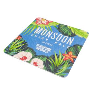
For Retail Promotions: Vibrant colours like red or yellow can create urgency and excitement. Limited-time promotional items in these colours can effectively drive impulse purchases and increase customer engagement.
For Brand Loyalty Programs: Choose colours that align with your core brand identity for items meant to foster long-term relationships. Consistent use of your signature colours across loyalty program merchandise reinforces brand recognition and creates a sense of belonging.
For Event Merchandise: Event-specific items can utilise seasonal colours or special colour variants of your standard palette to create collectability while maintaining brand cohesion.
Colour psychology is a well-established tool in branding and marketing. Its role should begin when you start your business, as it can significantly influence consumer perception and behaviour.
Remember that while colour psychology provides general guidelines, the most crucial factor is the perceived appropriateness of the colour for your specific brand. When colours align with your brand’s personality and values, they create a cohesive identity that resonates with consumers and drives long-term loyalty.
If you have already established your brand identity, including colours, but are now thinking about a different colour on your branded merchandise, then don’t panic. Subtle changes and a strong logo are still effective on branded items. We also suggest adding an accent colour across the brand that aligns with your business and colour psychology to give you more scope to choose from and help deliver that subtle message.
At Totally Branded, we can help you build your promotional merchandise stock in line with your brand and what you want to achieve from your promotional items.